Every rainy season, the same headlines come out of Lagos: homes flooded, families displaced, lives upended. This year was no different, with areas like Okokomaiko, Iba, and Isashi in Ojo Local Government Area (LGA) among the hardest hit.
As someone building a career around practical GIS work, I wanted to go beyond just reading the news and actually map out where and why this is happening. So I built a flood susceptibility map for Ojo LGA using Google Earth Engine (GEE), and this post walks through exactly how I did it — the process, the decisions, and a few honest lessons learned along the way.
Why Ojo LGA?
Ojo sits along Lagos's western corridor, bordering Ojo Creek and the Badagry Creek system. It's low-lying, coastal, and has seen real, well-documented flooding this year. That combination — flat terrain, proximity to water, and recent flood events — made it a strong candidate for a susceptibility study, both as a technical exercise and as something genuinely relevant to the people living there.
What Is Flood Susceptibility Mapping?
Flood susceptibility mapping doesn't predict exactly when or how badly an area will flood. Instead, it identifies which areas are structurally more prone to flooding based on physical characteristics like elevation, slope, proximity to water, rainfall, land cover, and vegetation. Think of it as a screening tool — a way to flag high-risk zones so residents, planners, and emergency responders can prioritize attention before the rain falls, not just react after.
The Workflow
1. Defining the Study Area
I used Nigeria's administrative boundaries (FAO GAUL dataset) to isolate Ojo LGA as my Area of Interest (AOI). Every layer that followed was clipped to this boundary.
2. Terrain Analysis: Elevation, Slope, and Wetness
Using the Copernicus GLO-30 Digital Elevation Model (DEM), I derived:
Elevation — lower ground holds and channels more water
Slope — flatter areas drain more slowly, letting water pool instead of running off
Topographic Wetness Index (TWI) — a combined measure of how much water tends to accumulate at a given point, based on terrain shape and upstream flow
One early technical hiccup worth mentioning: my first attempt at computing slope silently failed because the DEM mosaic lost its projection information. The fix was explicitly setting the projection before running the slope calculation — a good reminder that in GIS work, a "successful" script run doesn't always mean the output is actually correct. Always sanity-check your numbers.
3. Distance to Water
I combined two data sources: streams extracted from flow accumulation data, and the JRC Global Surface Water dataset (which captures both permanent and seasonal water bodies — important for a tidal creek system like Ojo's). From this combined water network, I calculated distance-to-water for every pixel in the AOI. Areas closer to water were flagged as higher risk.
4. Rainfall, Land Cover, and Vegetation
Rainfall: Using CHIRPS precipitation data, averaged across the rainy season (April–October) over multiple years, to capture typical wet-season intensity rather than a single year's anomaly.
Land Cover: ESA WorldCover data classified the AOI into built-up areas, wetlands, cropland, mangroves, and more. Built-up and wetland areas were treated as higher risk due to poor infiltration and natural water saturation, respectively.
NDVI (vegetation index): Derived from Sentinel-2 imagery, used as a proxy for infiltration capacity — sparser vegetation generally means less absorption and more runoff.
5. Reclassification and Weighted Overlay
Each of the seven factors above was reclassified onto a common 1 (low risk) to 5 (high risk) scale. I then combined them using a weighted overlay, assigning heavier weight to elevation and distance-to-water (the strongest predictors) and lighter weight to rainfall and NDVI (given CHIRPS's coarse resolution and some overlap with the land cover layer).
It's worth being transparent here: these weights were based on patterns commonly used in flood susceptibility literature, not derived from a formal pairwise comparison method (like AHP) or statistically validated against historical flood locations (like Frequency Ratio). That's a reasonable starting point for a screening-level map, but it's also the clearest next step for making this analysis more rigorous.
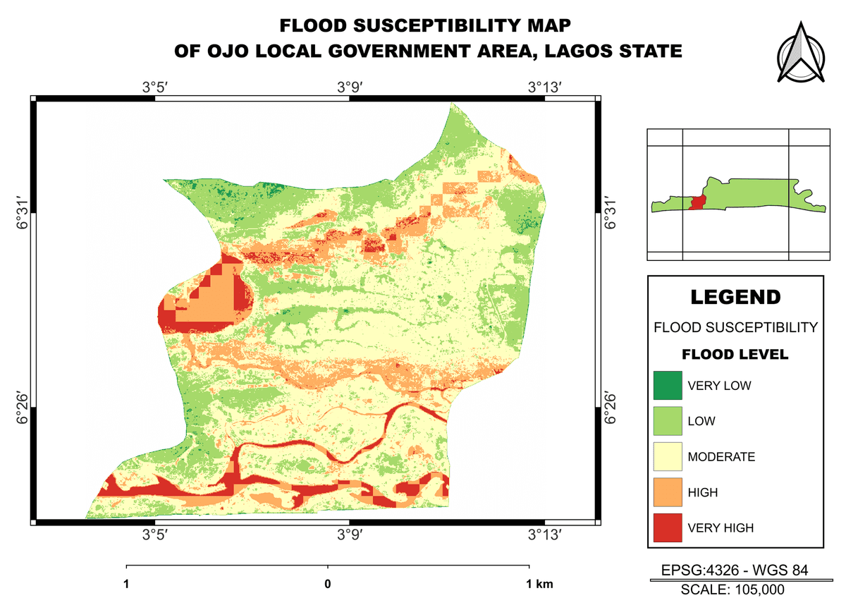
6. The Final Map
The output classifies Ojo LGA into five susceptibility zones — Very Low to Very High — giving a clear visual picture of where flood risk concentrates. Unsurprisingly, given Ojo's flat, low-lying, and increasingly urbanized character, a significant share of the LGA falls into the higher risk categories.
What This Project Taught Me
A few honest takeaways:
Data doesn't lie, but it does need scrutiny. More than once, a layer looked "wrong" (solid one color, masked pixels) not because the concept was flawed, but because of a technical issue upstream — a wrong collection ID, a missing projection, a threshold that didn't match the real data distribution. Trusting the first output without checking it would have produced a broken final map.
Resolution mismatches matter. Combining a 30m DEM with ~5km rainfall data means some layers carry far more spatial detail than others. Being upfront about that limitation matters for anyone relying on the result.
A map is a starting point, not a verdict. This susceptibility map tells a believable, terrain-driven story about flood risk in Ojo, but it isn't a substitute for ground-truthed validation against real flood event records — that's the natural next phase of this work.
Why This Matters
Flooding in Lagos isn't random. It follows terrain, drainage patterns, and land use decisions, and those patterns are visible in the data if you know where to look. Tools like Google Earth Engine make this kind of analysis accessible without needing expensive software or massive datasets sitting on a hard drive — which matters a lot for GIS practitioners working in African contexts where resources aren't always abundant.
This project is a small piece of a much bigger picture, but it's the kind of practical, locally grounded GIS work I want to keep building — projects that don't just demonstrate a skill, but actually say something useful about the place they're mapping.
Built using Google Earth Engine, Sentinel-2, Copernicus DEM, CHIRPS, ESA WorldCover, and JRC Global Surface Water. Final map styling done in QGIS.